PayPal Cash In & Out
2017 – 2018
About the project
At PayPal, we launched cash in experience to customers for better access to funds in their PayPal account. To expand product scope, we decided to optimize cash in experience and also launch cash out experience.
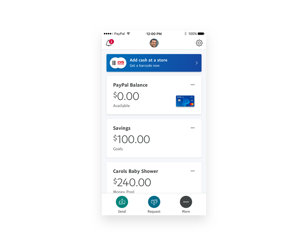
PayPal Cash (Add cash at a store)
Problem
The first version of a PayPal Cash was web based and we found around 90% of users were doing cash in activity with their mobile devices. Therefore, we decided to optimize PayPal Cash experience for mobile so we did a journey map exercise as the first step of redesign.
What we learned from journey map
Error messages were not clear enough to users.
Even though the flow was not complicated, because of main call to action was not clear enough, it was hard to proceed.
Experience was not scalable for more partnerships in the future.
User research
After first optimization of PayPal Cash experience, we decided to do another round of user research to understand their behaviour and mental model more. So, as a team, we brainstormed together to come up with several key points to focus for the this round of user research. After brainstorming, we got a key question to help us to define a problem to focus for the redesign.
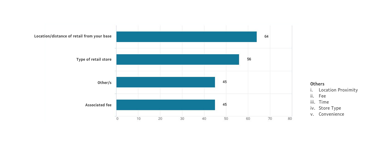
What factors do the customer take into consideration when deciding on retail location?
After first round, we got the top few reasons why users opted for 'Add Cash in Store' and those reasons were,
Convenient
Easy to use
Quick/Fast
And factors that customers consider while deciding on retail locations were,
Location/distance of retail from base
Retail Store type (CVS, Rite-Aid, & Eleven)
Fee and ‘Other’ (factors) were comparable
As a result, we found that location/location proximity and time are the major factors for customers during their decision making process.
Key screens
As a result, we found that location/location proximity and time are the major factors for customers during their decision making process. So we are now showing store brands on each pins so that user can make decision easier. Also, changes screen view from 50:50 map/list view to full map/list view because users were more preferred to focus on either map or list than mixed view.
One more design change is adding shortcut on home screen. One of a user behaviour we found was closing app and come back to PayPal app once they arrive to a store. By adding shortcut to PayPal Cash code, user does not need to go through code generation flow again.
Result
By improving PayPal Cash experience, as a result, we made huge increase on number of usage.
Users
from 1,313 (Jul 2017) to 11,371 (Jul 2018)
Number of transactions
from 2,592 (Jul 2017) to 21,524 (Jul 2018)
Total Volume
from $363,516 (Jul 2017) to $3,342,320 (Jul 2018)
Walmart Cash Out
Goal
As a team focusing underserved segment of users, we always want to empower PayPal customers to make their own financial decisions with the least amount of dependencies. Since we are launching cash out feature with a partnership with Walmart, for phase 1, we are optimizing product experience for a single store use case (Walmart).
By auditing Cash In Store usage and conducting user testing, we captured two important points.
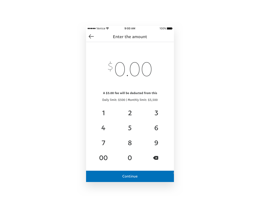
Having fees up front to customers make them confident about their action.
Since the most of customers come in to the flow with solid intention, instructions could be ignored easily.
And then after multiple iterations, we came up with a good-to-go design for the first release.


