Carta – Investor Services
Introduction
Start with why
Today, Carta has a product for investors to manage and analyze their portfolio. Investors want to see data across their portfolio in one place. We have a lot of valuable data at the company level, but often, investors want to answer questions at the portfolio level. However, our current product experience is not doing that job well.
To drive engagement and further establish Carta as the source of truth, we aim to help investors answer these questions within Carta.
Problems
Investors cannot see what has been changed since they last logged in.
Investors cannot quickly find an answer to the question they have.
Investors cannot get insights and forecasts of their portfolio.
However,
While I was analyzing user interviews, I found that the problems cannot be just solved by optimizing the home page. What we had to provide investors was a more holistic solution.
So I went to the confluence page of user interviews and broke down quotes to the digestible nugget size. Then, I used the methodology called “user synthesis board” to do deep dive.
My role in the team
In the investor services team, my role was a solution owner of investor portfolio experience. I led multiple design exercises for my team and other designers to empathize the problem, exhaust all possible solutions and experiment our hypothesis with customers to build the best experience that we can provide.
What I learned
After spending some time with the synthesis board, I found some interesting repeating patterns that were easily noticeable but important nonetheless.
All investor firms have their way of analyzing and querying their portfolio.
Investors want to see an up-to-date portfolio and the updates that were made.
Investors want multiple data reports and forecasts with different scenarios to make sure they are making well-informed decisions.
Some Investors want to be able to see all data in one platform
Planning
User research analysis gave a lot of interesting insights on user needs and their behaviour. With that, I had several discussions with my project manager to establish our scope and strategy, and realize which makes Carta as a source of the truth for investors.
For the first phase, we will focus on fixing existing problems. Then, in the second phase, we will touch up on the information architecture which is the larger scope of the problem. In parallel, the design team will take an initiative to the deal pipeline for a deeper understanding since Carta has yet to tackle a deal pipeline problem.
Investor experience design plan
Phase 1
Portfolio Dashboard Redesign
Portfolio V1
Before portfolio dashboard, when investors land on Carta, we take them to the ‘logos’ page. The design of the page was mobile-friendly. However, the experience could not answer the questions investor had, and it was hard to get bird’s-eye view into their portfolio.
Goal
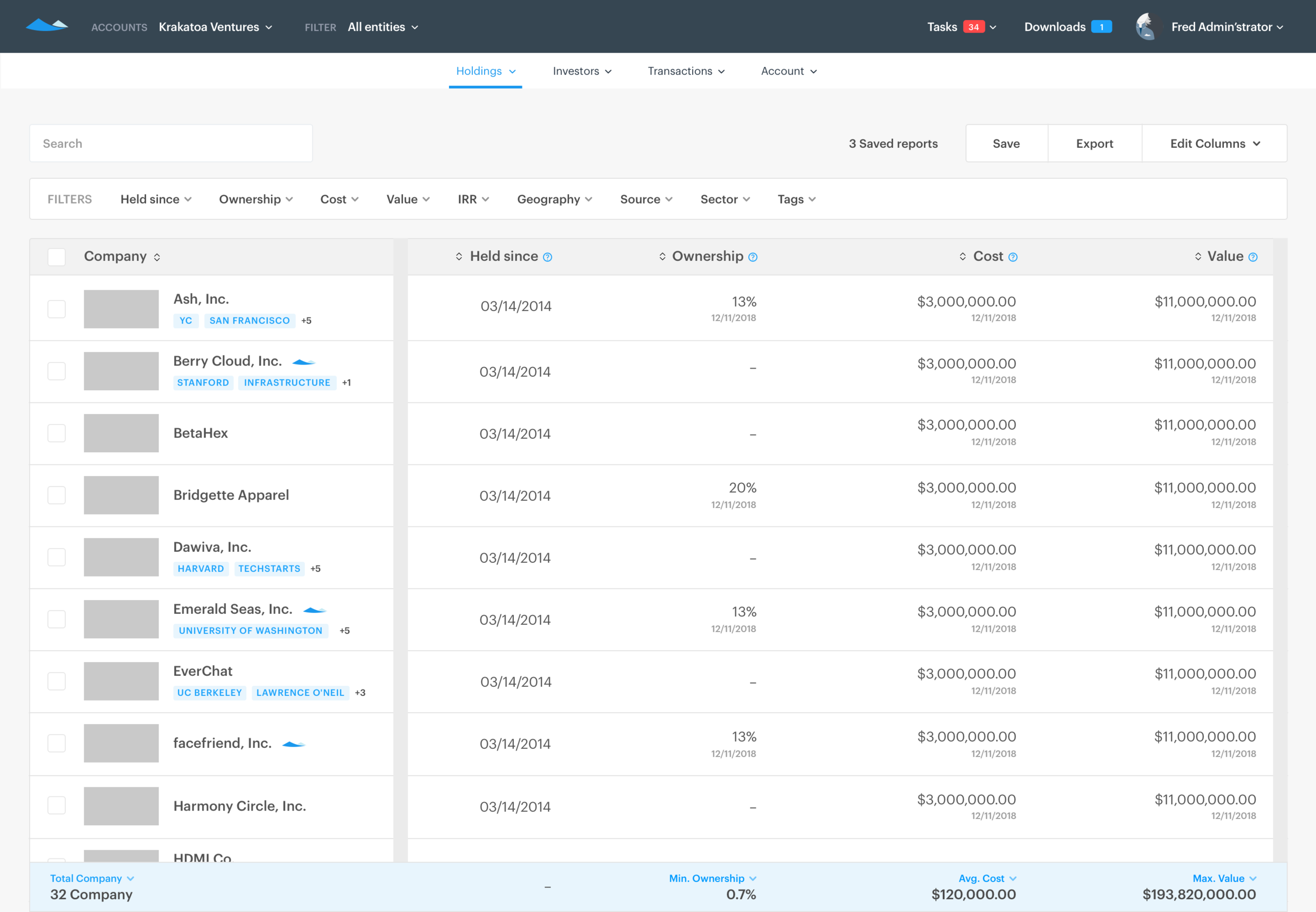
Our goal was to create a valuable landing experience for investors that allows investors to better consume data across their portfolio company, customize their view, and answer critical questions.
Success metrics
Engagement by General Partners and Investment team members on the new page
Overall engagement (Monthly active user) for General Partners
Information Architecture (Portfolio V1)
First of all, since our team had limited engineering resource and deadline, we wanted to focus on minimum viable experience and scalability for next iterations and implementations. Therefore, my first task was defining the IA of the new portfolio page.
Micro-interactions (Portfolio V1)
In the long term, the new portfolio page will become a data query tool for premium subscribers. So the new portfolio dashboard required lots of new micro-interactions to make entry points up-front to them.
Key screens
Marketing blog post for the new portfolio dashboard
Phase 2
Portfolio Management
Portfolio management
Even though we solve the problem of dashboard and landing experience, still some data shown to customers are incorrect because of several reasons (i.e. company did not update their cap table).
However, investors cannot update the cost or value of their investment by themselves. And if the data shown to users are incorrect, they won’t perceive Carta as a source of truth, and they will find no reason to utilize Carta to manage their portfolio. Therefore, our team’s next move was to fix the portfolio data problem.
Goal
For Carta to become a source of truth for our customers, the entry point to the portfolio management flow should be easy to find. Also, all information regarding cost, value, and updates should be clearly displayed.
Success metrics
Reduce the number of support tickets created by investors for incorrect portfolio data
Increase general partners engagement (MAU, WAU)
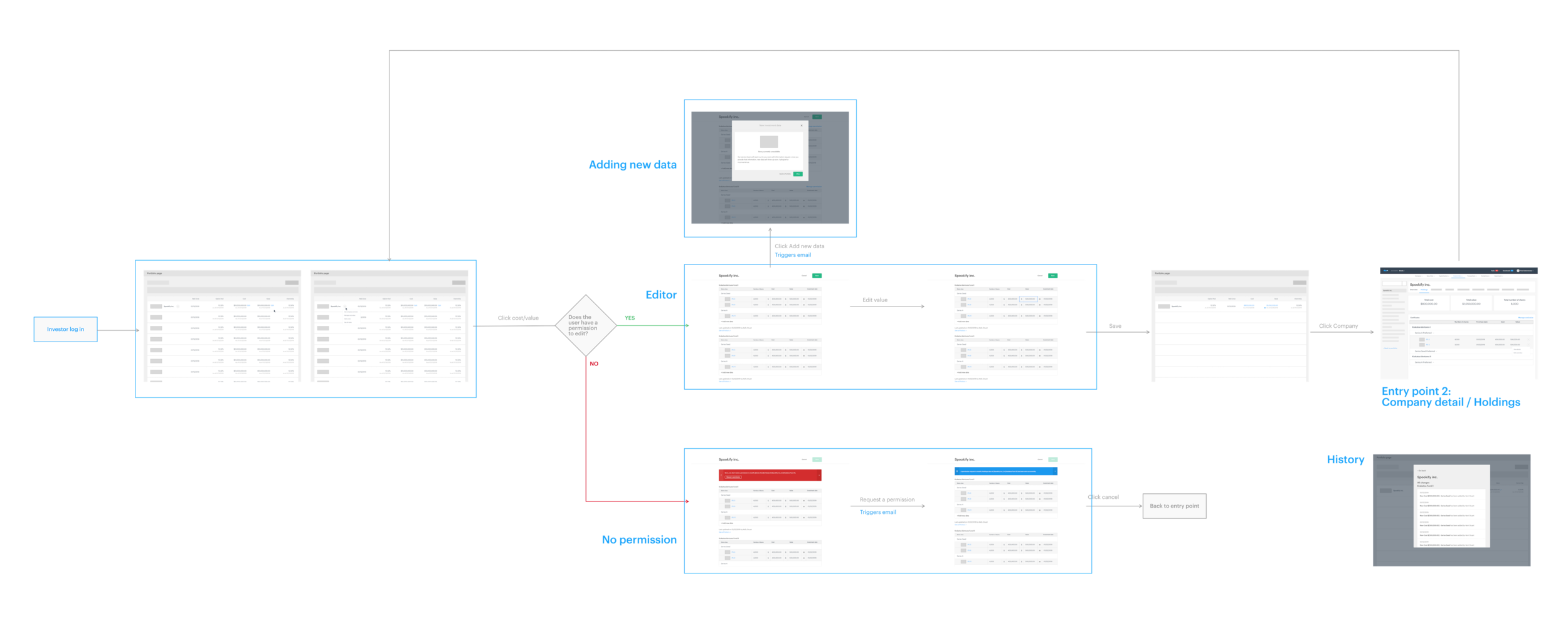
Wireflow (North star)
Wireflow (V1)
Key screens
Phase 3 (In progress)
Investor CRM
Introduction
Since the deal pipeline product will complete Carta’s investor experience, it has been in our roadmap for a long time. However, pre-deal is the new world that Carta hasn’t been explored yet. So we wanted to solve this problem by an agile approach to reduce the risk. First of all, there are lots of good products in the market such as Salesforce, Affinity, etc.
Therefore, to to convince our users to use our product, we decided to focus on our strength, which is that investors can utilize a scenario modeling tool for your future investment.
However,
To allow investors to create scenarios for the forecast of their future returns, first of all, they need a cap table to simulate.
However, today, on Carta, investor portfolio does not include any pre-invest companies. Therefore, we decided to introduce the concept of a sandbox which will scale to investor CRM.


